|
|
|
|
|
ArtRage
at its core is a very powerful brush-engine. Photoshop purists
generally freak out when they first try it; it’s unwieldy, imprecise,
and has a limited range of functions. The trick here is to realize that
you can’t make ArtRage do things it wasn’t meant
for. Suppress your need for absolute control and allow for the
unexpected to happen. When
you first start up the program and play around with the
standard oil brush, you soon end up with a mess of thick, smeary paint
that doesn't look like anything. The default setting is probably
designed to show off the
fancy brush engine - but for most people it won’t be useful to work
with. Traditional painters often start off a new
piece with a lot of thinner in the paint, and then slowly
build thicker colors. Since ArtRage imitates real life in
this sense this is what you have to do here as well. 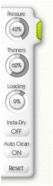 Between Loading and Thinners, as well as adjusting the size of the brush, this is just about all you need to know to get started. There are other useful tools in there too if you want to expand on your range of expression.
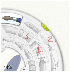
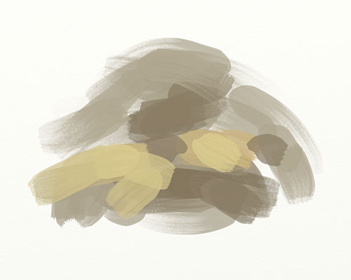
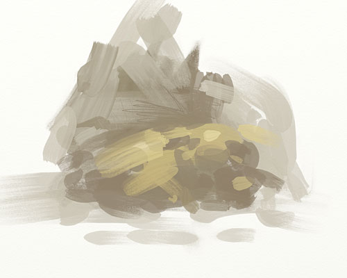
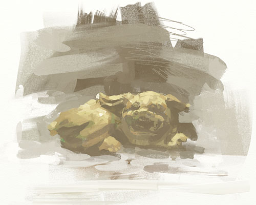
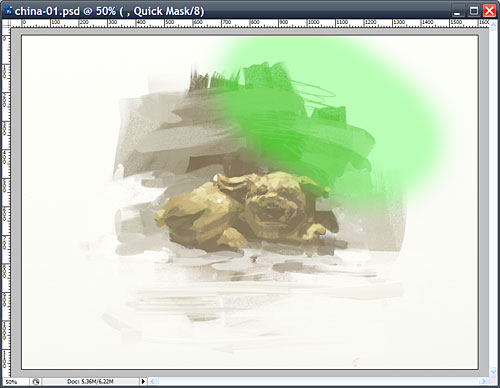
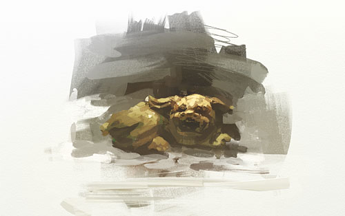
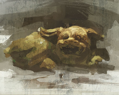
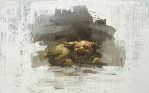
The Roller (1) is good because it’s big and lets you lay down base colors quickly. With the Palette Knife (2) you can push paint around. It doesn’t offer the same amount of control as the one in Painter, but it can create a lot of interesting texture and drift in color. Try them out and use what makes sense to you, forget about the other stuff. Also, if anyone manages to create a compelling image with the Glitter brush (3) I'd love to see it. My model for this picture was this little guy, who usually rests on the windowsill. 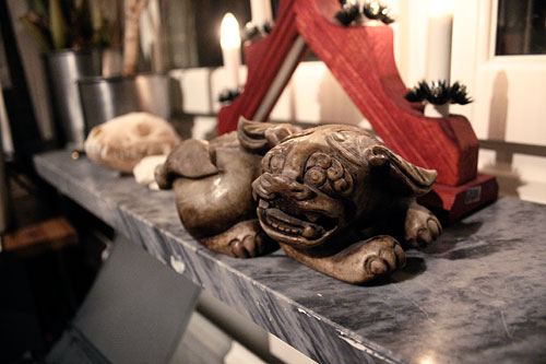 I started the painting in ArtRage by laying down some base color shapes with the Oil brush. Lots of Thinners, little Loading on the brush, I work fast just to get a rough idea of what to make. This is what it looks like about 20 seconds in. There’s no way for someone other than me to tell where this is going. Some people like to start with detailed sketches, worried that they’ll mess up the drawing if they don’t. But this is digital! We can go back and forth on this forever, moving stuff around, editing, fixing, adding canvas or cropping the piece until it works. There’s nothing that can’t be solved later. At this stage, work fast, work in light- to mid-range tones, don’t go too dark. It’s usually easier to go darker later on than it is to brighten something that is too dark from the start. With speed you tend to make a lot of intuitive choices, your marks are more fluent and expressive. Don’t think too hard on drawing, if a line isn’t right then make another one right beside it. Two wrongs can make a right. These are all happy accidents that will bring texture and life to your work later on. See, there’s an ugly little pig taking shape in there now, about one minute into the process. After about twenty minutes in ArtRage I have laid down the base of the painting. The drawing is far from perfect, it looks washed out, and it’s still in screen resolution, but it’s a foundation for something to build upon. The general idea and disposition is to have a dark background that accents the bright top head of the sculpture, then keep its body in shadow and finish off in the bottom with a bright color. It’s a quite simple trick to alternate dark and bright areas of a painting in this way to make it dynamic. Migrating into Photoshop I scaled up the picture to something print-worthy, the long side around 4-5k pixels. This is not an ideal way to work, but so far it’s the best compromise that I have found. The reason for not starting the picture at a higher resolution is that both the ArtRage and the Painter brushes are made to look their best in 1:1 screen resolution, that’s where you get all of those nice, naturalistic brush marks. By scaling the picture at this stage some of that detail and texture will make it into the final image, though slightly blurred and with the occasional pixel artifact. I tweaked the contrast and brightness of the picture using Levels. Not uniformly though, using the Quick Mask I masked the areas I wanted to manipulate with a big soft brush. The
area around the head now has a lot more contrast, and I’ve also applied
a slightly blue-tinted gradient in the upper left corner. All the
yellow in the picture became overwhelming and had to be offset with
something. I think of this stage as pulling out things in the image
that are already there, enhancing the main features of the composition
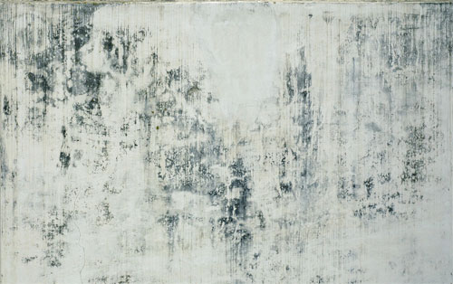
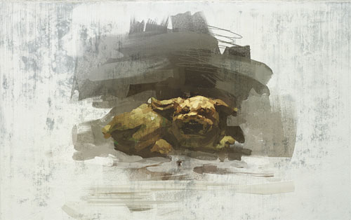
to direct attention to places of interest. I slapped it on top of my picture with blend mode set to ‘multiply’ at about 40% opacity. The
flat texture mixes with the painted areas and lots of unexpected things
happen. Good or bad, using photographic elements in your pictures will
change the expression of the piece quite a lot; it can easily become
sterile and impersonal. If you value your brushstrokes and the
“hand-made mark” very highly this might not be for you, but I would
still recommend trying out this very same method but with a texture
that you have actually painted (perhaps in ArtRage!) My
main focus for this piece is Piglet’s face, so I bring the picture into
Painter and start working on it. Any sane person would probably do this
in Photoshop, but I like what painter has to offer;
it’s more expressive and fluent than Photoshop, but it’s not as
unwieldy as ArtRage. It’s a nice middle-ground between the two for
doing detail work.
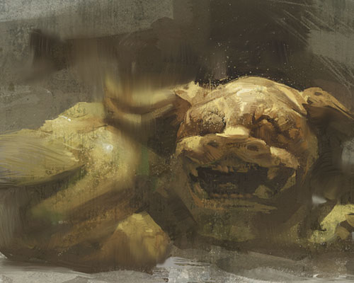
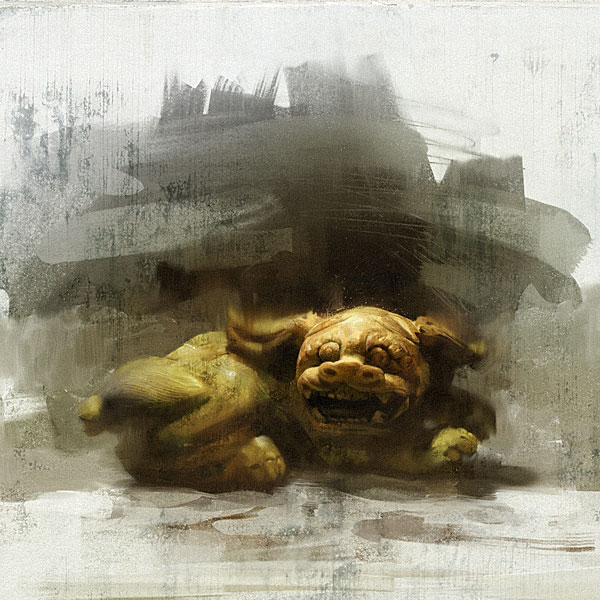
At this stage it’s time to slow down the tempo a bit, and be more careful about where you refine the picture. There are still a lot of very expressive marks in there right now, and the risk here is to start smoothing everything out, to be the teacher’s pet and make it all look “nice”. There’s enough of that work out there, be different. Your best tool for this is to squint with your eyes. Looking at the picture with your eyes partly closed will filter out a lot of detail and information, only leaving you with the larger shapes. This way you can catch elements of the painting that have too much contrast, or shapes that appear out of place. Feel your way through it and only dive in to fix things that pop out and seem out of place. In this close up we can see the current progress of the face, it’s getting more detailed now but there’s still room for improvement. The ear bothered me a bit so I used Painter’s Palette Knife to blur it out. The general problem was that the sharp shapes and light/dark contrast of them stole the attention from the face, drawing too much focus. Notice the dark shape in the background, almost like a shadow of the ear. That shape was there very early on but was very angular and pointing downwards; by making it look more like the ear these two shapes strengthen each other. If you can find repeating shapes in your painting then it’s often a good idea to emphasize these to make the picture stronger. I brought the picture back into Photoshop and kept working on the face-area. I wanted to create as much contrast between it and the very expressive and chaotic brushstrokes around it. Using the Quickmask and various color correcting tools I increased the contrast and enhanced the colors in much the same way as I would have done working on a photograph. The buttons are there, so why not have the same freedom as photographers in altering and enhancing your pictures? Here’s the final result:
|
|
|