|
|
|
|
|
Artist Theory: Colour
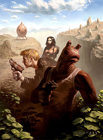
There’s something fundamentally appealing about space-men in leather jackets, friendly humanoid aliens and space-girls in tight bodysuits. There's a charming innocence to people flying around in space and landing on all sorts of weird planets, getting caught up in adventure and romance on alien worlds... It kind of makes you wish it was you with that cool zap-gun and the 50’s leather jacket. People have complained that the alien in this picture looks too much like Jar-Jar Binks from Star Wars, and as stupid as it may sound this was entirely coincidental. I just didn’t see it until it was too late. I hated that character. The color in this piece is intended to add 'air' and atmosphere to the scene. I wanted the viewer to smell the breeze of this alien land, and to get a sense of playful adventure. I started with a brown and ochre base, to have a warm foundation for the painting. I’ve heard people say that warm sells better, but I don’t really know if that’s true. The painters of old did it like this, and if it isn’t broken why fix it? With an under painting in shades of brown, I started to add accents of color, for instance the dark red on our alien hero, and the yellow hair on his human side-kick. To get the most out of all these warm colors I needed something for them to play off. If everything’s in brown, red and yellow it may well look very pretty, but it doesn’t get dynamic and punchy. A blue sky provides that much-needed contrast, and with the sky in place all the warm colors tend to appear even warmer. Try covering the sky with your hand and keep it like that for a little while to let your eyes adjust. When you remove it, it should bring a whole new dimension to the painting. In my head this effect almost makes a sound. “Swoooosh!” Take a look at the green leaves at the bottom. The Photoshop color-picker tells me that they’re all yellow, but they don’t appear yellow at all. This owes to the fact that the surrounding colors are mostly red. This is the exact same effect as with the sky; as soon as you have a strong red on a painting everything else tends to appear greener. You can try this by painting a neutral grey next to a bright red, the effect is quite remarkable.
|
|
|