|
|
|
|
|
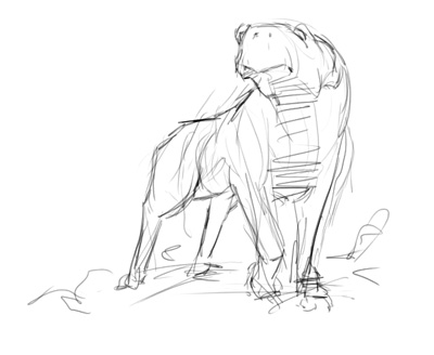
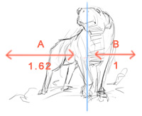
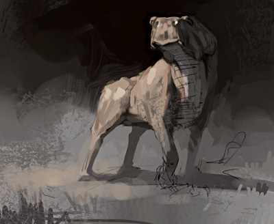
This is my fourth or fifth shot at making a tutorial. I failed miserably all the other times, probably because tried too hard... So this time I tried to make it as simple as possible. 1) Sketch Oh well. I scribbled something quick and it looked like this: I used the Pencils' 2B Pencil variant in Painter, looks a lot like a real pencil. You might be able to tell that I don't sketch much. It doesn't matter what the sketch looks like, there's plenty of time to change your mind as you go along. Keeping it loose is the key in this. And yeah, the front of the body is roughly at the golden mean. That's the relationship between points, as displayed in this example: That means that, in this case, the distance between the head and the left edge (A) is 1.62 compared to the head and the right edge (B). You can read up on that if you like, but I don't see the point in constructing your images from it. I didn't think about that when I did this one, it just happened. This relationship between forms and shapes will probably appear in your work wether you like it or not, it's one of the mysteries of art. 2) Adding color 3) Tightening
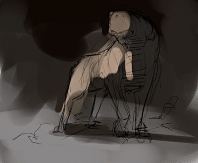
shapes I used several brush variants for this, mainly the Brushes' Variable Flat and some Dry Media variants. 4) Bringing it
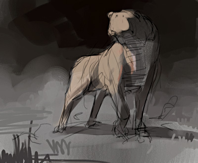
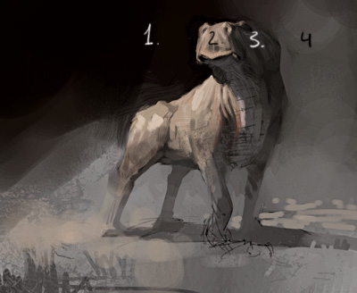
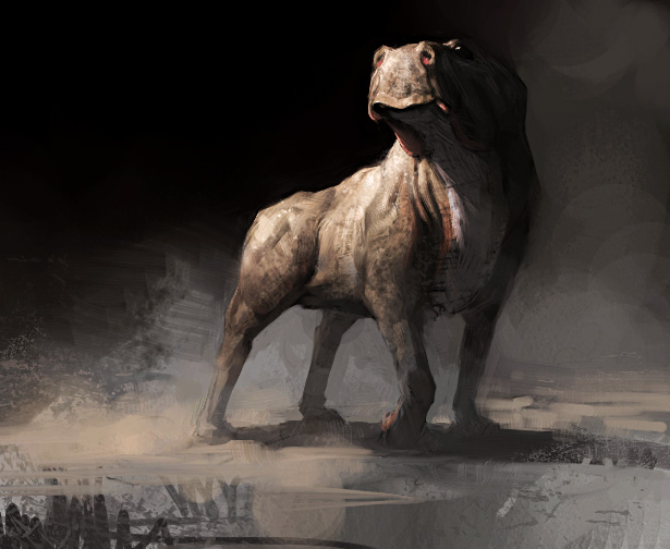
together I mirror the image constantly now ("flip horizontal" under Effects/Orientation). It's a life-saver, really! Maybe the biggest advantage of working on the computer as opposed to painting on a canvas, sure beats the hell out of looking at the piece through a mirror. It helps you to spot your own mistakes, and to get a fresh look at what you're doing. The sketch was everywhere in there when I did this. Not necessarily a bad thing, but it can be quite annoying. The option is of course to erase some of the drawing before flattening the image, but you didn't expect me to think of that did you? There are lots of brush variants in play here, crayons, brushes etc. I use as many as I can, because they all bring a certain personality to what you're doing. A rough material is best painted with a rough brush, or that's the general idea. It's also good to beat the piece up a bit, to show who's in charge. You can't let it run you, you must run it. Kill your darlings. 5) Getting close I also added a lot of detail, as well as removing other things. The trick is to keep your eye relaxed and allowing it to move freely over the piece. If you find you're being drawn somewhere you're not supposed to be drawn, you need to fix it. Working on the whole piece is the only solution to this, if you're focusing too much on one part you're gonna have a hard time making the picture work. Always move your focus and work on the thing that looks the worst at the moment. The selections you make will bring definition to some areas and keep others rough and alive. This way you direct and control the attention of the viewers eye. Speaking of eyes, I removed the left eye of the creature. Bad drawing, it should be obscured by the muzzle. 6) The result I also upped the contrast on it. A bit like cheating, I know, but the button is there so why not use it? |
|
|