|
|
|
Painting
tutorial 2 Introduction If you're new to the way I work you might want to check out the first tutorial I wrote, Basic CG Painting. I won't go into a whole lot of detail here regarding the use of specific techniques, this document is intended to give an insight into a style of working. Nothing revolutionary, people have been doing this for hundreds of years, but here it is. Before we start I thought I'd share something Ann Petersson Malmstedt, a great teacher and painter, taught me at art school. It's a philosophy on the creative process, really quite simple. Since there are no absolute truths in this business you can't expect it to help you out in any given situation, but it has helped me tremendously:
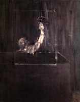
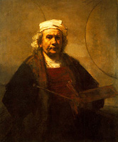
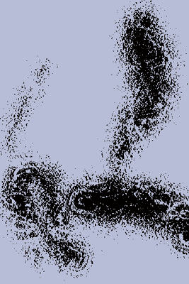
This thing with stages has got absolutely nothing to do with quality. For me it's just a way to keep track on where you are and where you're going on a painting. Some paintings need a lot of stages and others would be destroyed by it. This piece by Francis Bacon is maybe a stage three or four... ...where as Rembrandt wouldn't stop until somewhere around ten or twelve: I use this model to a great degree, but I break the rules as often as not. You only need it when something's not working. It's hard to identify the stages on the painting I will demonstrate here, I backtrack and mess around quite a bit. But try thinking about your work in this way, it can be of great use! 1) The first bold steps I didn't really know what I was looking for, I had an idea, and a certain feeling that I wanted the piece to have - but no clear notion of how that could be translated onto a canvas. That meant keeping an open mind to lots of possibilities, and keeping the painting open to changes. I was making it up as I went. I started with a slightly colored canvas, picked a brush (I believe this is the Brushes' Graphic Paintbrush Soft), and made some strokes at random:
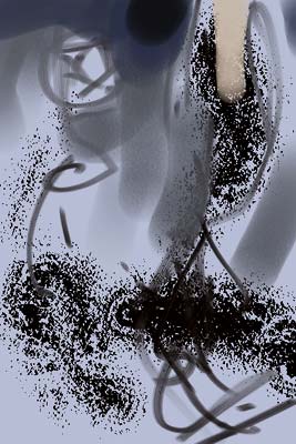
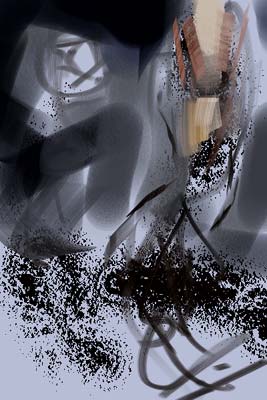
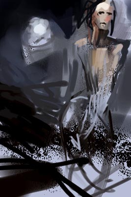
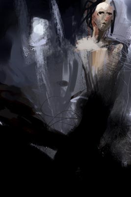
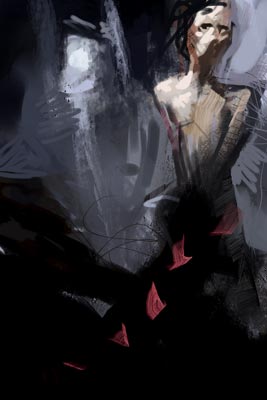
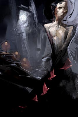
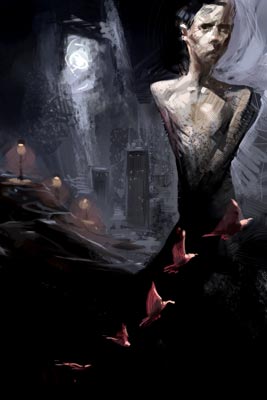
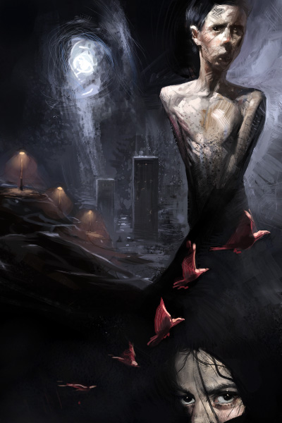
Well, not quite random. I knew I wanted the figure of a human in the picture, and the upper right black turd represents that figure. More on this later. This picture is about 2 seconds into the painting. A few seconds later it looked like this: A lot of things have happened here. Basically I'm trying to a) make the turd look like something human, and b) provide a way for the eye to move smoothly from the dark areas to the light (that's what the greys and the midtones are for). I've saved out a bit of the light blue background in the upper left, it looks like a star or a symbol of some sort. I figured it would make a nice sun, moon, or other visible source of light in this piece. There's nothing like a bit of moonlight to jazz up a composition. As usual I use lots of different brush variants. The more, the merrier. Chances are that the brush will in fact provide clues on how to make the piece work. Happy accidents DO happen, you just have to wait them out. Moving on... This is the part I love, it's as close to rock 'n' roll as painting gets. Do you see the woman? It's there. Still a mystery, with lots of options left open. There are a million ways to move from here, but I'm only interested in a few of them at the moment. There's nothing like the feeling when you know you'll make something awesome, that it'll be easy from here on. Yeah right. (2 Down the crapper I failed to resist painting a face on the figure (big no-no! No details yet!). One thing led to another, and before I knew it everything looked like crap. I wasn't going to give up that easy though, sometimes it's necessary to wrestle with a painting. Some things were still moving in the right direction, a sky was forming behind the figure, as well as a cold moon. I realised that this was going to take some work. The major problem - the only REAL problem - was that it wasn't going the way I wanted it to. Sure, there are problems with the drawing, the composition is hanging on by a thread etc... But the expression is all wrong, and ultimately that's what it's all about. I had to get back that sense of direction I had before, and that meant taking back some amount of control over the piece. Pretty drawings be damned, I let my brain rest for a while and went strictly on gut feeling: It quickly turned very black. Some interesting shifts in color appeared in the sky, a deeper blue to the left and a bit more grey to the right. I'm breaking up the crappy shape of the figure. I thought it was going to be a woman standing there but now I'm not so sure. The moon (yeah, it is in fact going to be a moon) got some nice streaks of blue leading the eye down. Don't know where just yet. It's all floating around, and I keep at it. I spent some time trying to figure out what to make of the person standing there. I'm not thinking about it as a human too much; it's a shape that needs to work and to express something. That will require some amount of proper anatomy, but I'm careful not to force a realistic aspect into the piece. Knowing myself I know it will sneak it's way in there regardless, so it's best not to think about it and keep it as open as possible. The person is now male, as it should be for this one. I'm slowly regaining control, I've found a balance in it that I can build on. That means I've taken the painting out of it's butt-ugly phase and entered a new one... 3) Closing in I'm now at a point where I can see where this is going. I've got a decent composition, the colors are muted and work nicely together. I felt like adding another color, this time a strong one. I used the Brushes' Loaded Palette Knife, picked a cool red color, and made some dabs on the canvas: Whaddayaknow! It looks like birds!! Since birds are awesome I decided to keep them. Strangely, they fitted extremely well with the theme... Now that they're there, I can't imagine this piece without them. Time for another element, the ground and the streetlights. The shape of the ground was there all along, I just didn't see it until now. I added accents of light from the moon to bring out the shapes. Like always I'm working on the entire picture all the time, things are changed, new ideas replace old ones: I have no clear-cut reason for putting streetlights in there. They're a symbol of some sort, I don't know what that signifies, but more importantly they make the picture work the way I want it to. The moon now looks like a big light shining through a rip in the sky. I love it. High-rises poked out of the ground, and the birds got volume. I could leave it like this, and that's what I did (for about two hours). When I looked at it again I realised some things could be done. I could take it further into a new stage. That big hole in the sky is standing with one foot in abstraction and the other in a sketch stage, it needs a push in either direction. I'm not convinced by the buildings, and there's something not quite right about the boy. The eyes have just the right look to them, but the body doesn't quite follow up... 4) As far as it will go I was working slowly now, carefully. Everything I add will take force away from the initial strokes, it will weaken the impact of the picture. That's the biggest reason why I leave so much raw in my pieces, I'm totally in love with the energy of that first stroke. The moon got more of a halo with thin lines of a rich blue color. The boy had his shoulders moved around. It's now more realistic in that sense, but that's not quite what I wanted.. I'm leaving it like that though. I added a slight dark blue tone beneath the boy, increasing the depth between the birds and the boy. There's also a new face down there. Odd placement, but I think it works. Looks like someone covered with a veil, makes the boy look very naked. The result surprised me, the birds for example - they bring a sense of urgency to it that I didn't know that I wanted. I spent about five hours painting this one (not counting the coffee-breaks). |
|
|