|
Painting Light And Shadow
Tutorial
By: Mattias Snygg
This is a tutorial on how to
paint the Royal Gala apple from Brazil. It's also a primer on light,
and a little bit of everything. It's hard to pick a suitable subject
for a tutorial, and apples is as good one as any.
I used Photoshop CS for this tutorial, but the
things discussed here apply to most other painting software. It's aimed
toward the more advanced Photoshop user, in this one I assume you know
how to get the software to do what you want. If you want to learn how
to make custom brushes, or something else of a technical nature,
you should look somewhere else (pressing F1 in Photoshop is a good
start).
|
1. Sketch
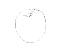
I grabbed an
apple from the fridge and put it on my desk. Scribble-scribble and voilà!
A line drawing.
|
2. Blocking in rough color
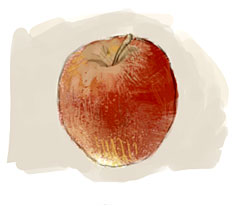
I created a new layer and
set the layer blending mode to "Multiply". Now I could to anything on
top of my drawing without risking losing the lines. I went to work on
it with lots of different brushes, keeping the real apple in the corner
of my eye. At this point I was only interested in the surface - no
shadows yet. I tried to replicate the complex and interesting shifts in
color that you can find on the skin of an apple, while still keeping it
as lose and free as possible.
To a certain degree this
picture is lying; there were lines going across everything when I did
this. Only when I was more or less satisfied with how the apple looked
did I clean up the areas around it with a flat beige.
|
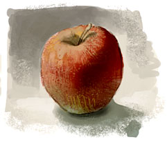
3. Adding shadow
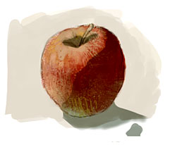
Here's where the
cheating begins. I added yet another Multiply layer, on top of the
first one. Then I picked a grey/green color (the tiny blob in the lower
right) and painted on top of the apple.
Now all that nice detail
from the initial painting is preserved, and I could easily change the
shape of the shadow without altering the stuff behind it.
The shape of the shadow is
just a rough estimate - there weren't any hard edges to the shadow on
the real apple on my desk. At this point I just wanted to get
an idea of the lights and darks.
|
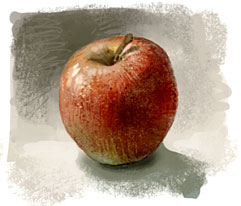
| 4. Tweaking the darks
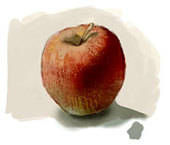
Here I started to play
around with the shadow layer. I used the eraser and other soft-edged
brushes to smooth out the edges of the shadow. Not everywhere though,
there are still hard edges up where the little stick goes in as well as
on the table (or what the hell that thing is sitting on).
Ah the benefits of working
with layers!
Looking at the apple I
noticed that the right edge was almost as bright as the part that was
in direct light (the light bounced off the table and lit up a part that
should have been in the shadow). I took this into account and carefully
brightened the shadow.
|
5. Background meets foreground
Here's a real cheap trick.
You see what I did with the background in the upper left? It's now
darker than the lit face of the apple. And the background in the lower
right is noticeably brighter than the shadowy part of the apple.
This is an easy way to
create a bit of drama in a painting. The rule of thumb is to put a dark
color next to a lit surface, and a bright color next to a shadowy
surface. The old masters knew this, Rembrandt did it all the time, and
it's still a very convenient (if a little predictable) method to add
intensity to what you're doing.
The apple I painted didn't
really look anything like this, but in a hundred years who's gonna care?
|
6. Highlights and we're done!
Well, not quite... Working
with layers is all good and well, but there are significant drawbacks.
You don't see the
"handmade mark" in a piece constructed with a lot of fancy effects. The
trace of human will, the putting-brush-to-canvas-making-a-mark part is
vital to any work of art, simply because we're human. I want to see the
traces of someone's deliberate attempt to describe something, the
absolute attention it takes to make a mark that really brings out the
essence of... uh.. an apple for example.
To that end I flattened
the image and let go of all the technical stuff. I tried to paint
the apple, using what I had done so far as a color sketch. Not as a
blueprint, but as a foundation for something else.
Not that it made much of a
difference in this case, but the ambition was there.
|
Closing words
So is this method any good for
doing other things than fruit and academic exercises? I don't know.
I've used it quite a number of times for both personal and professional
work, here's one example: Guts
My recommendation is to use any
means necessary to get the ball rolling, while still keeping the image
close and personal. For each computer-generated effect, 3D rendered
perspective grid, or adjustment layer you put yourself one step further
away from the painting. If finger-painting is the closest and most
personal means of applying paint to a canvas (short of using your
genitalia, but let's not go there) then using the computer already puts
you at more than an arm's length from what you're doing. Every thought
and impulse you wish to put into your work goes through a lot of
filters; first the chunky, insensitive and crude drawing-tablet, after
that your painting software makes an even cruder interpretation of what
you want, and finally your monitor does its own thing with showing you
color and shape that's at a horribly low resolution.
Add a bunch of fancy,
prefabricated effects and you'll soon find yourself working like a
scientist rather than an artist. Like working your canvas with the
brush attached to a 2 meter pole. Or looking at it through half a dozen
sheets of glass.
Some of this can't be helped if
you want to use the computer for your art. Some of it is enormously
enjoyable. But if you try to keep these things in mind you can save
yourself a lot of grief, and hopefully create better art in the process.
Back to menu
|